PickMe Food- Making food delivery effortless and intuitive- UX/UI Case Study
Project objectives and project scope
Project scope
PickMe Food is Sri Lankan online food delivery platform launched by PickMe in 2018. PickMe Food also provides on-demand grocery, essential medicines and package delivery service called PickMe Flash. PickMe Food rivals international Uber Eats and would make the industry a duopoly.
I selected this app for analysis based on my personal experience as a user. While utilizing the service to order food, I encountered an incident that highlighted areas for potential improvement. This firsthand experience provides valuable insights into the app's functionality and customer service processes.
Let’s see how i overcome these challenges.. 🏆
Project objective
- Analyze the current state of PickMe Food's food ordering service.
- Identify areas for UX improvement in the food ordering process.
- Propose solutions to enhance user experience and increase market share.
- As a personal objective, Improve my skills on research, analyzing and problem solving.
Scope Inclusions ✅
- Analysis of the food ordering user interface and user experience.
- Examination of customer feedback and ratings system.
Scope Exclude ❌
- Restaurant partner onboarding process.
- PickMe rider food delivering process.
- Marketing and advertising strategies.
- Payment methods and security measures.
Constrains
- Time constraints for completing the case study
- Budget limitations for research and analysis
- Limited access to PickMe's internal data
"This case study is conducted under the assumption of limited access to Pickme's proprietary data. As such, it is based on hypothetical scenarios and is intended for educational purposes only."
Let’s Begin 🤪
First I explored the Pickme food feature and used it. Not being an active user of that PickMe app, it is kind of a challenge for me to understand about the business model and understand customers' mental models and behaviours.for a moment I forget about the case study and try to use the app as a real user with a real need. I tried to think from different different perspectives. while using it i noticed a few usability issues and saw a few areas that could improve the visual design.
However, after that, I started the defining process with these things in mind
"Design a better usable and discoverable food ordering experience for the users"
Process 🙂
The steps i taken to achieve this task.
At the start of the project, Considering the possibilities and timeline I decide to choose the steps need to undertake first.
Discovery and research 🔎
As my first step in my research, I decided to browsed internet to find more details about PickMe food and competitors, I was lucky to find some Reddit posts and few articles about PickMe food and other competitors.
Here is what i found
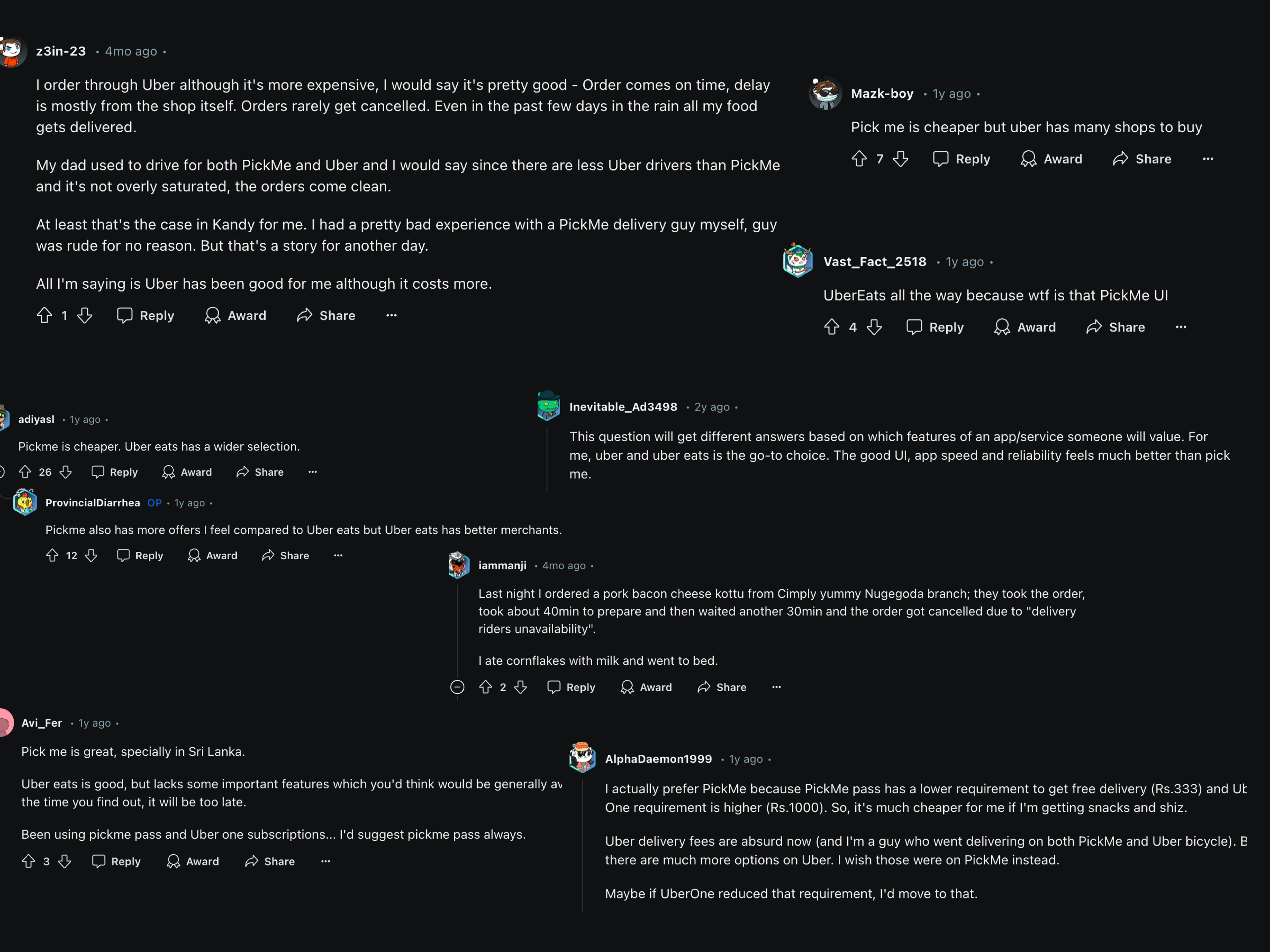
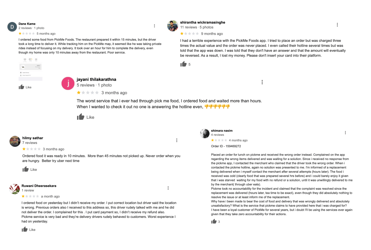
After diving web, I was fortunate to find a lot of reviews and conversations about PickMe foods and other food delivering services in Sri Lanka.
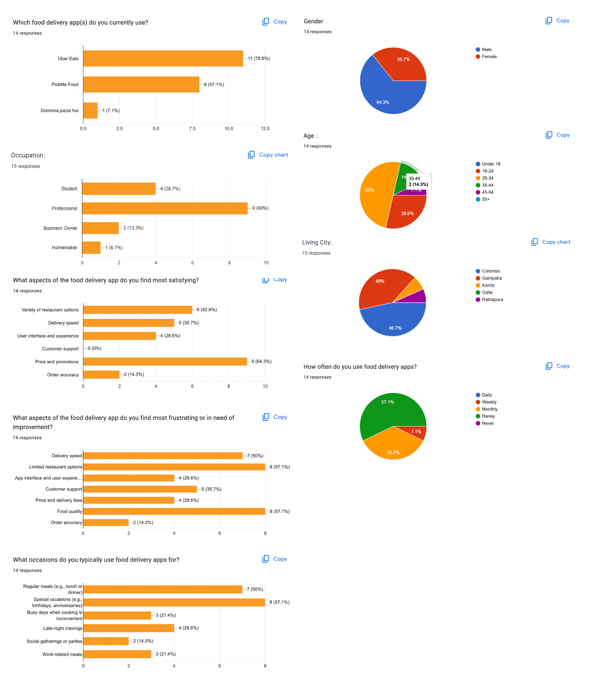
View Google Form (Survey)
Survey findings
Proto persona (I) 🧑
_rzzaypf6AnhZ8EA81R-jz.png?width=3840&quality=80&format=auto)
Proto persona (2) 🧑
_aYQDLLH4xrMCKF06aUMKr.png?width=3840&quality=80&format=auto)
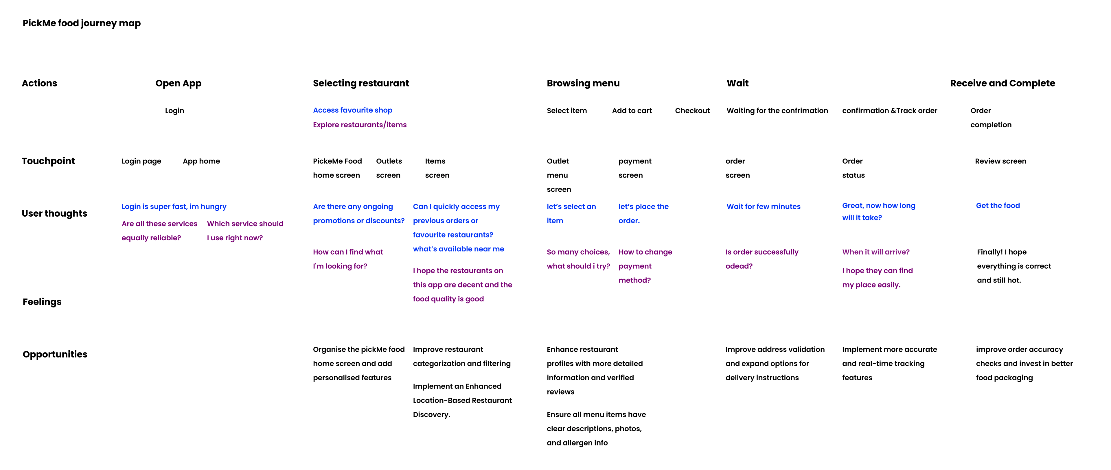
User journey map
After mapping problems and features, i was tend to create a single journey map that highlights variations between two personas i have identified. This approach can be particularly useful when the core journey is similar, but there are notable differences at specific points.Let's get our two personas:
1. Busy Professional -Food Enthusiast (BP): Values speed and convenience 💙2. Elderly person (EP): Enjoys exploring new cuisines and restaurants 💜
Problem Definition
Problem Definition serves as a bridge between the research phase and the ideation phase. It transforms user insights into actionable statements that can guide our creative problem-solving process.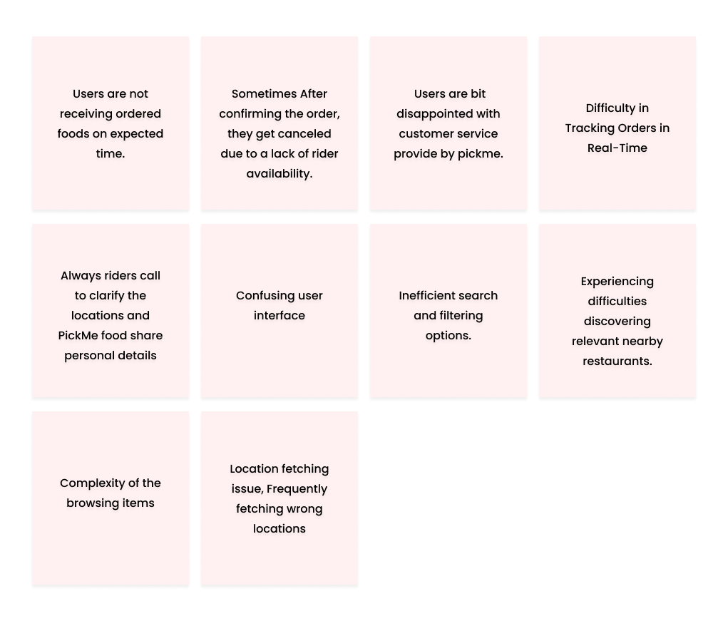
Ideation
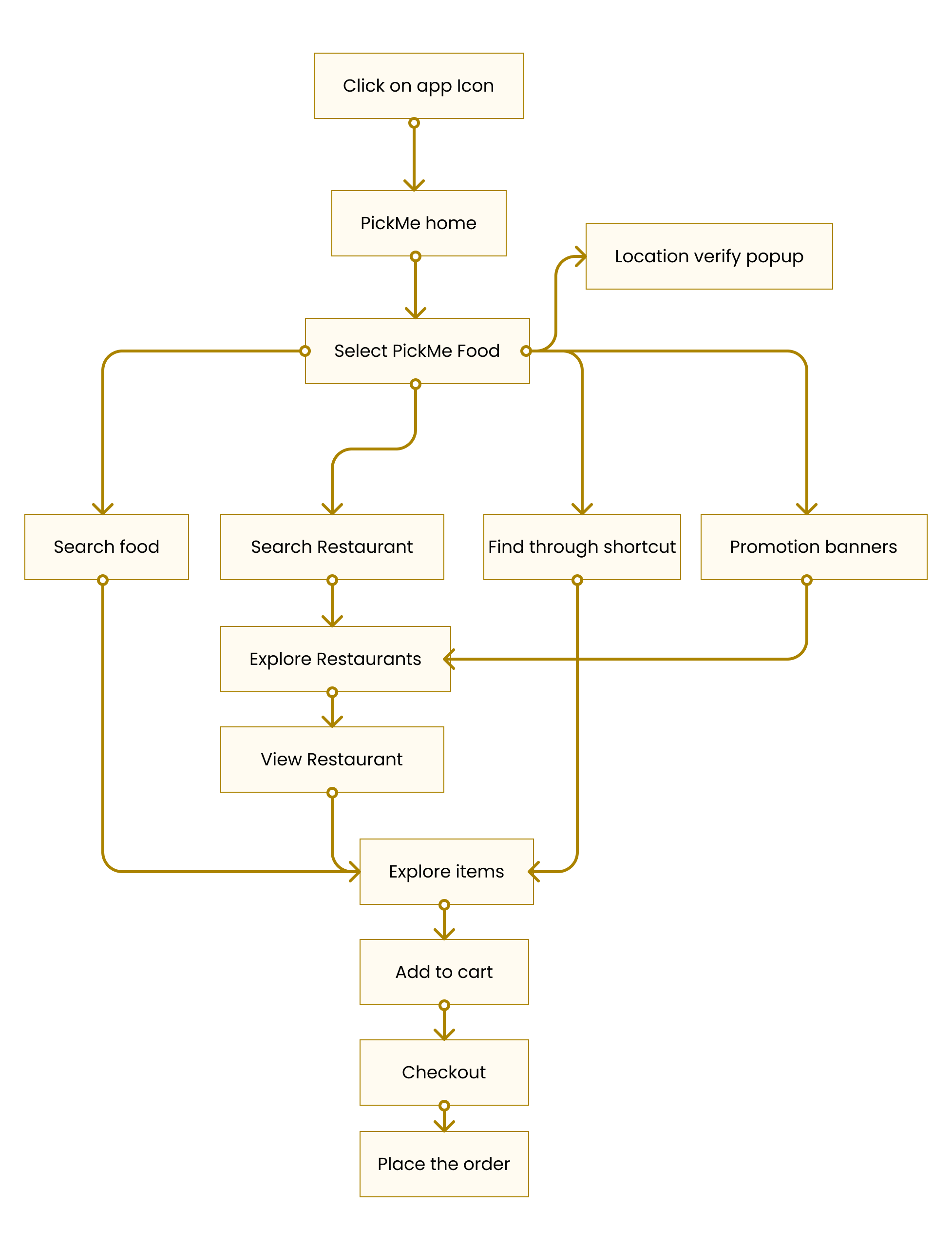
Solution & Design 🎨
I began drawing out different screen designs. I wanted to see how the product might look and work. By creating lots of quick sketches, I could test out many ideas without getting stuck on one approach. This helped me move fast and find the best way to design the user interface, making changes easily as I went along.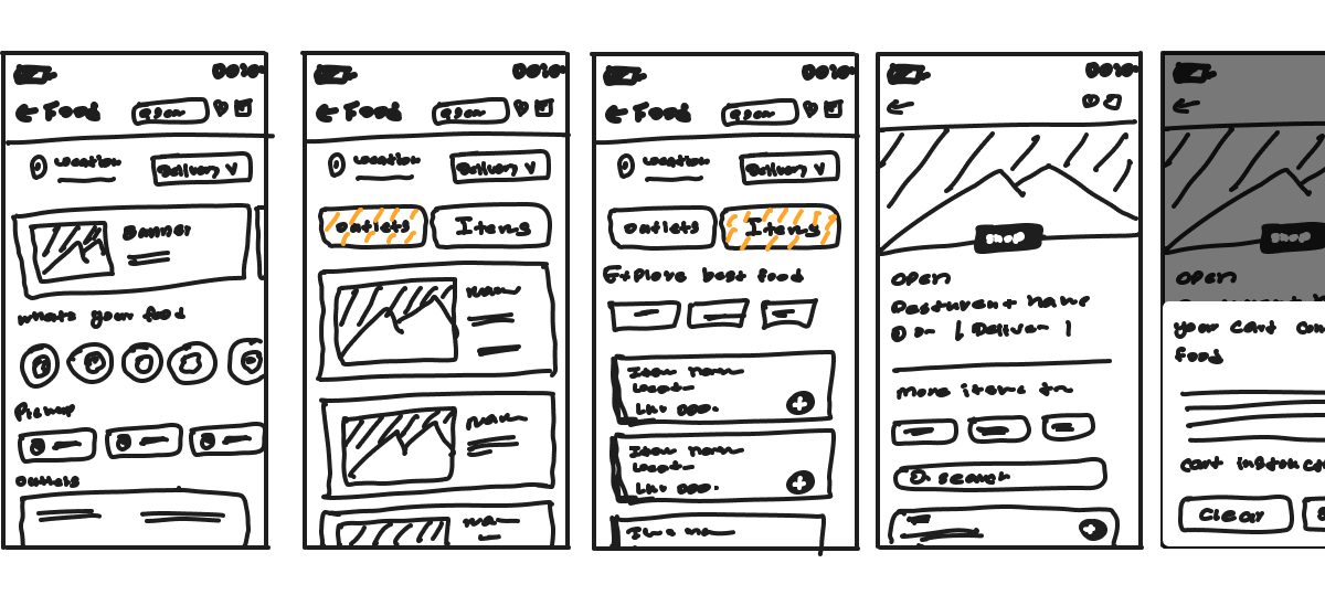
1. Personalized Location-Based Restaurant Suggestions
The platform implements an advanced recommendation engine that suggests restaurants based on the user's current location. This system goes beyond simple proximity-based suggestions by incorporating multiple data points to ensure highly relevant recommendations.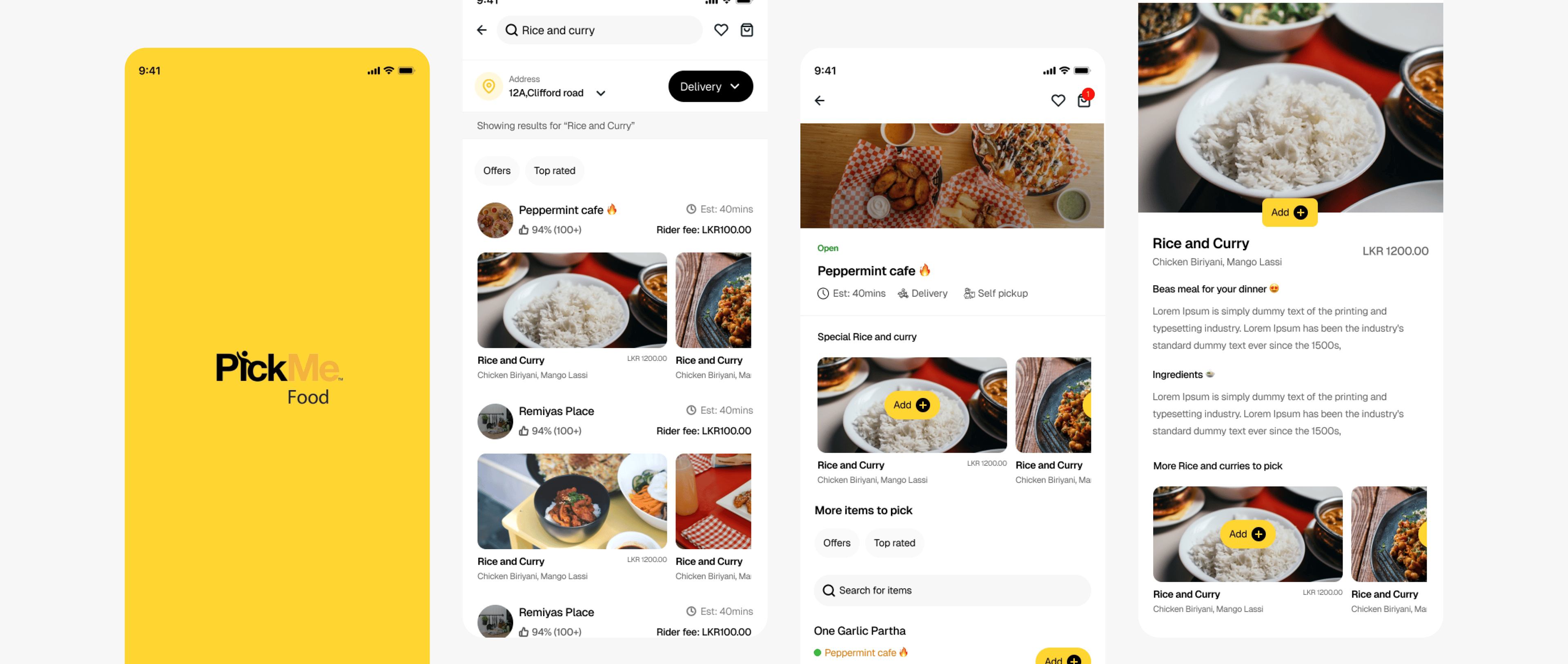
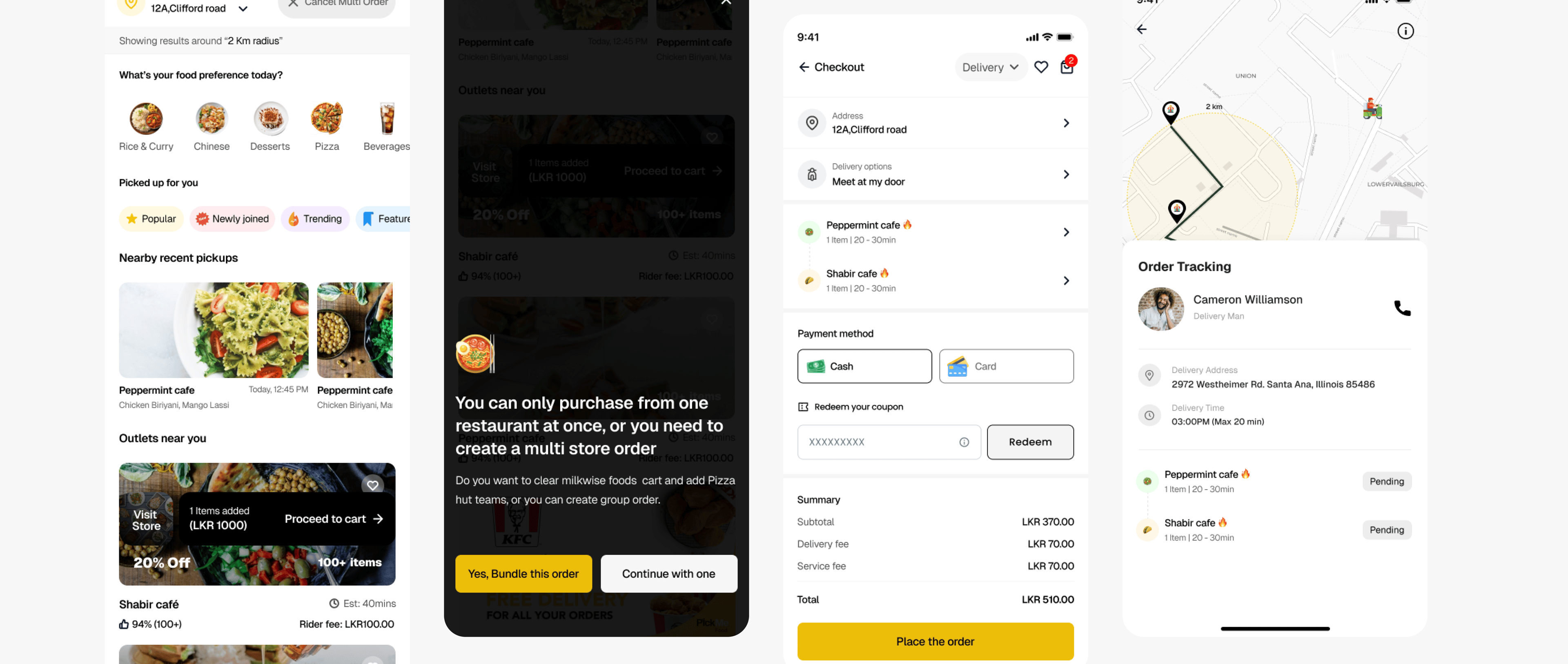
2. Multi-Store Food Ordering
3. Quick Access to Frequent Restaurants
This feature streamlines the ordering process by providing instant access to the user's most frequently visited restaurants. The system learns from user behavior to create a personalized quick-access component that evolves with the user's preferences.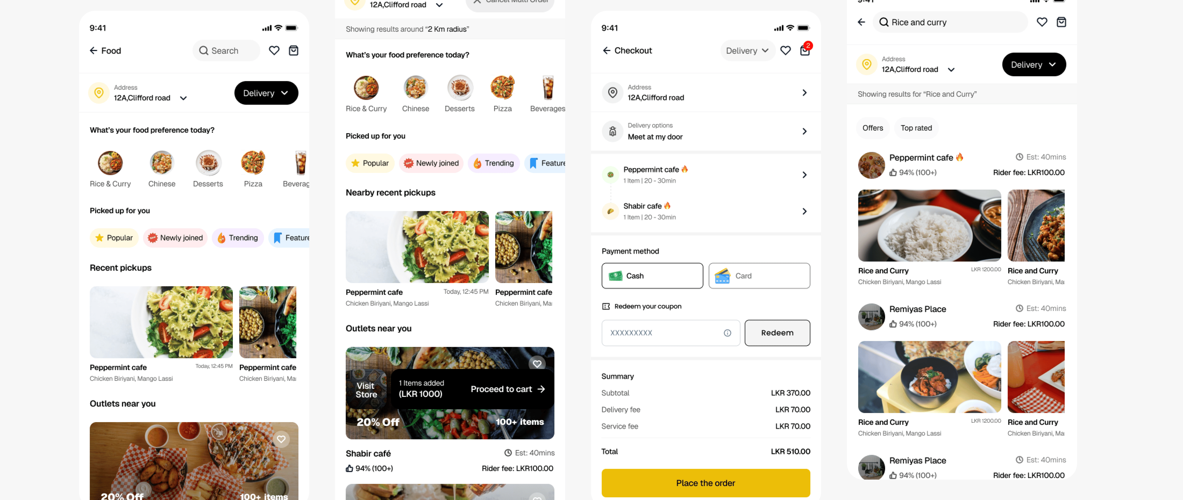
4. Enhanced Notification System
The notification system combines push notifications with device sound integration to create a more engaging and effective communication channel. This multi-sensory approach ensures important updates are noticed without being intrusive.Key Aspects:
🔮 Custom sound alerts for different order stages.
🔮 Device-native sound integration for familiar notification experience.
🔮 Smart notification timing based on user preferences.
Figma Prototype
Conclusion:
This project has been a valuable learning experience in understanding how technical solutions can solve real-world problems. The challenges faced and overcome have provided significant insights into both technical implementation and user experience design. The skills and knowledge gained will be invaluable for future projects in the food delivery space and beyond.